Logo →
Logo
Pro-active and always moving forward, our logo feels solid, reliable and industrial. It should be included on all IDRIC marketing and communication material.
We have horizontal and vertical versions. In both versions, the arrows always move forward. Please use the version that best suits the page shape and size.
Logo colour
Our logo can be applied in black, blue or white. Please use the version that best suits the application and always ensure sufficient contrast for legibility.

A navy version of the primary logo is necessary to achieve contrast with light backgrounds or for use on a small scale.

A white version of the primary logo is necessary when used on our blue.

A blue version of the primary logo is necessary when used on white backgrounds.
Logomark
Our logomark can be used independently in blue, white or black. Please use the version that best suits the application and always ensure sufficient contrast for legibility.


Clear space
Horizontal logo

Vertical Logo
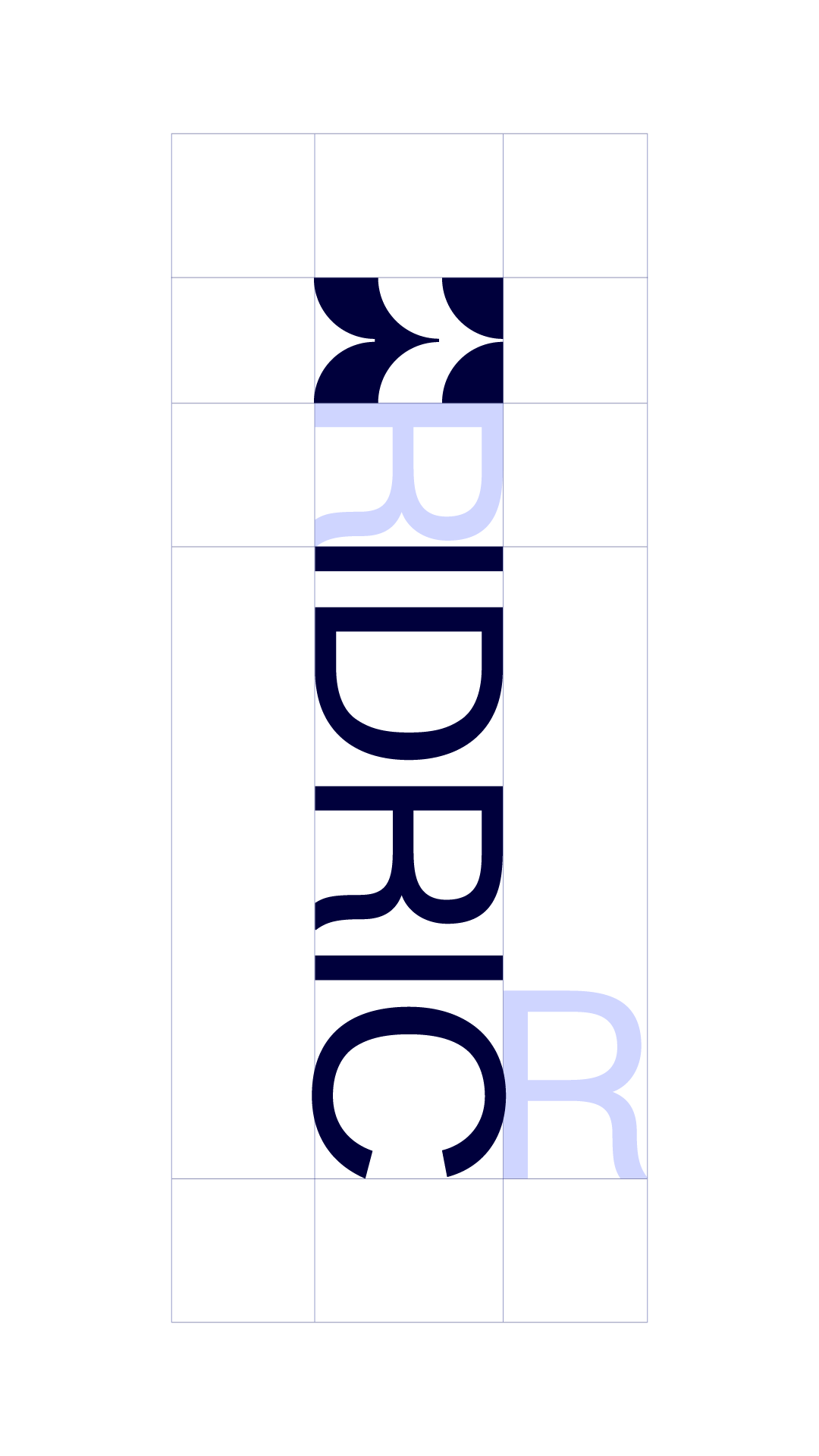
When reproduced, we ask that adequate clear space is allowed around the logo. This ensure legibility and clarity. Some applications may require reduced clear space but this should be pre-approved by the marketing and brand team.
Tagline
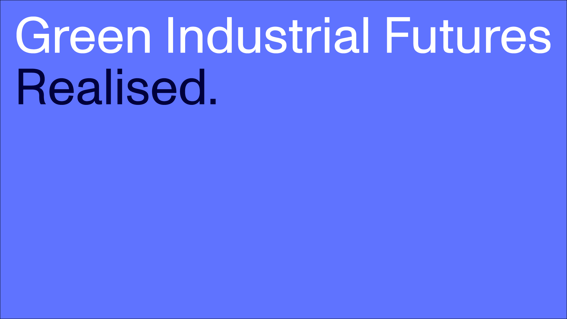
Our tagline can be applied in two colour ways. Please use the version that best suits the application and always ensure sufficient contrast for legibility.
UKRI logo
The UKRI logo should be present on all material. The logo has horizontal and position will vary but should not exceed the size of the IDRIC logo.
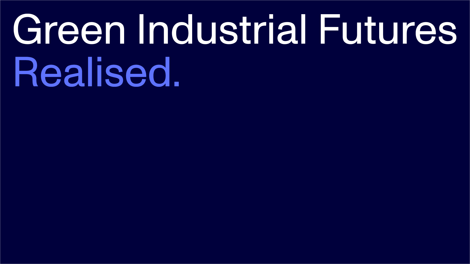
Preferred colouring
White logo, for use on dark backgrounds
