Icons →
We have a wide range of icons available for use across all digital and printed material.

Due to the specialist nature of our work, icons should always be used in conjunction with text to help:
Increase visual impact
Communicate faster
Make content more digestible
Readability from longer distances
Top-level icons
Created from the brand pattern and intentionally abstract due to the breadth of content covered.


Primary icons
These bespoke designs capture aspects of our work that are highly specialised and specific to what we do.


Secondary Icons
Our work is ever-evolving so we need access to a wide range of icons that can cope with continuous change. To provide maximum flexibility we can utilise the royalty-free icon library within Microsoft Office. These icons will be used for more common topics and areas. We only use the keyline icons, not the filled versions.
These icons should always sit within a bearer box, to provide a direct link with the IDRIC brand. The curved can be applied to any single corner.
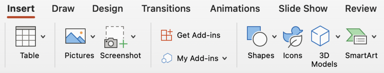
Access via Insert > Icons


How to use
Our icons are primarily designed to communicate quickly, so cropping and manipulation should be avoided.
Icons should only be presented in dark blue or white, on a sufficiently contrasting background colour.

